Case Study · Mobile Design
Cali-ID.
Reimagining California's digital identity for the modern age.
Case Study · Mobile Design
Reimagining California's digital identity for the modern age.
01 · Overview
As our lives increasingly move into the digital realm, physical wallets, credit cards, driver's licenses, even state IDs, feel a little outdated. What if you could carry your California ID in your pocket, fully secure, and instantly accessible? That's where Cali-ID comes in.
02 · The Challenge
While researching for this project I found three major issues in the designs for existing state IDs.
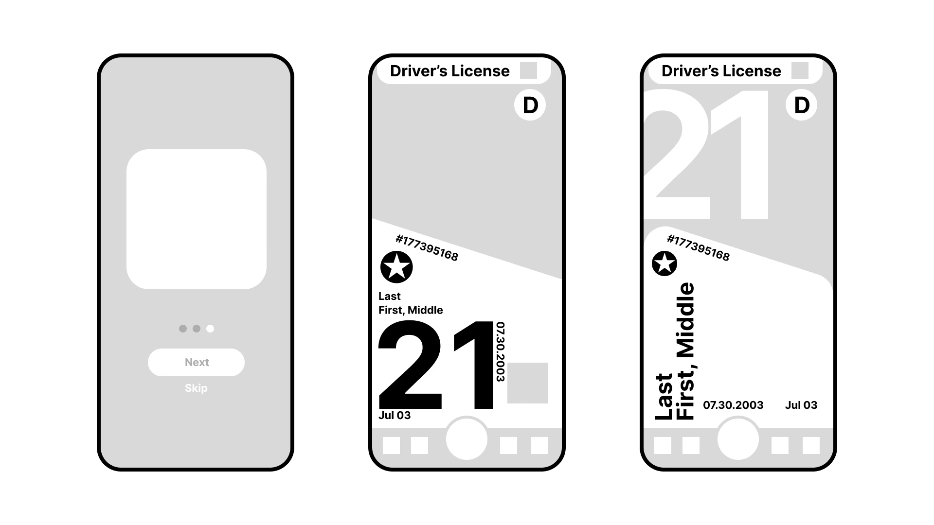
03 · Research
I referenced and researched numerous different existing physical and digital IDs, including California's physical ID, New York's physical ID, and the CA Digital DMV Wallet.
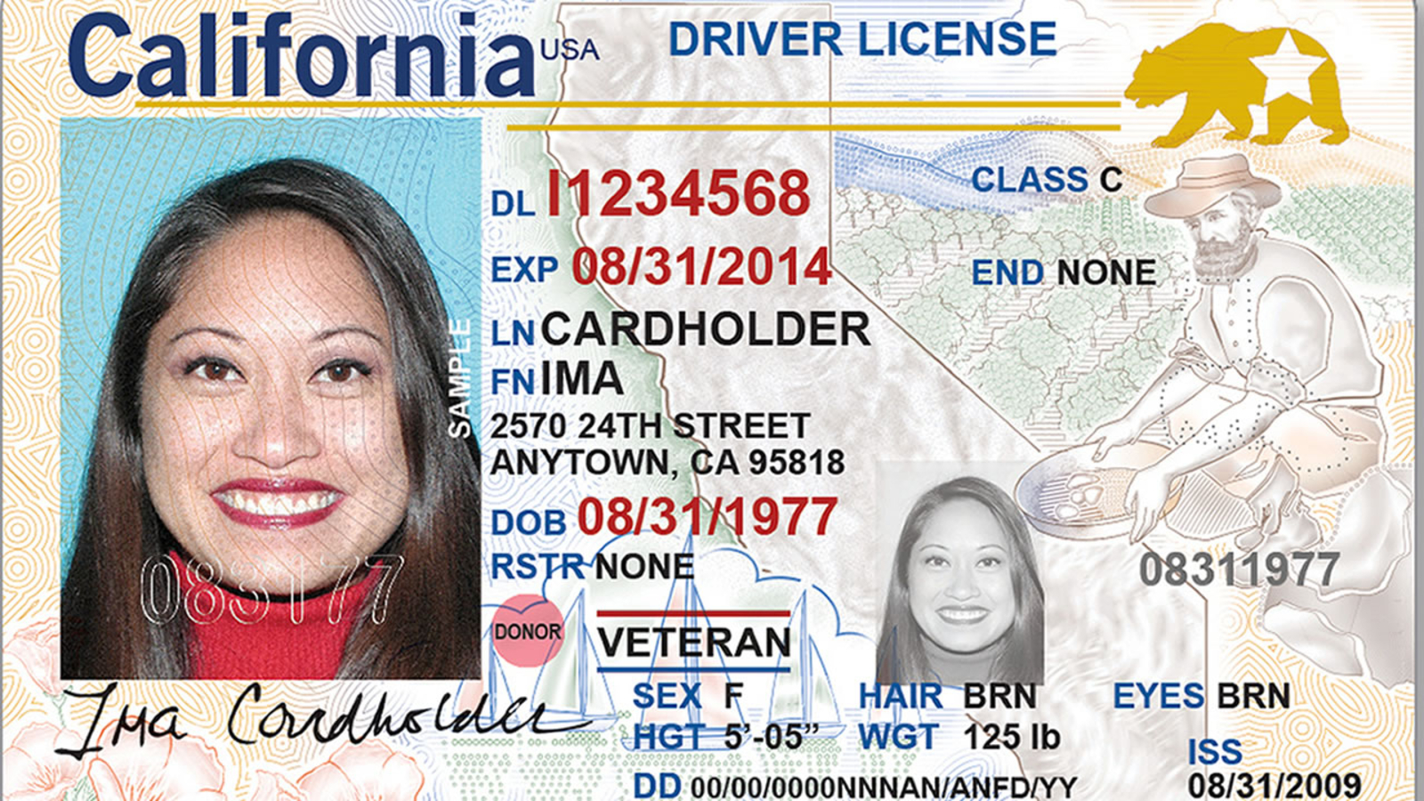
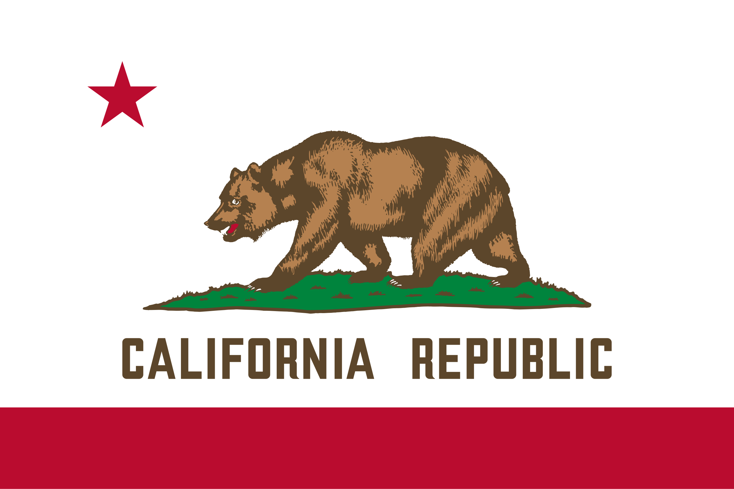
California's current physical ID. Visually busy, unclear type hierarchy, and sensitive information too easily accessible.
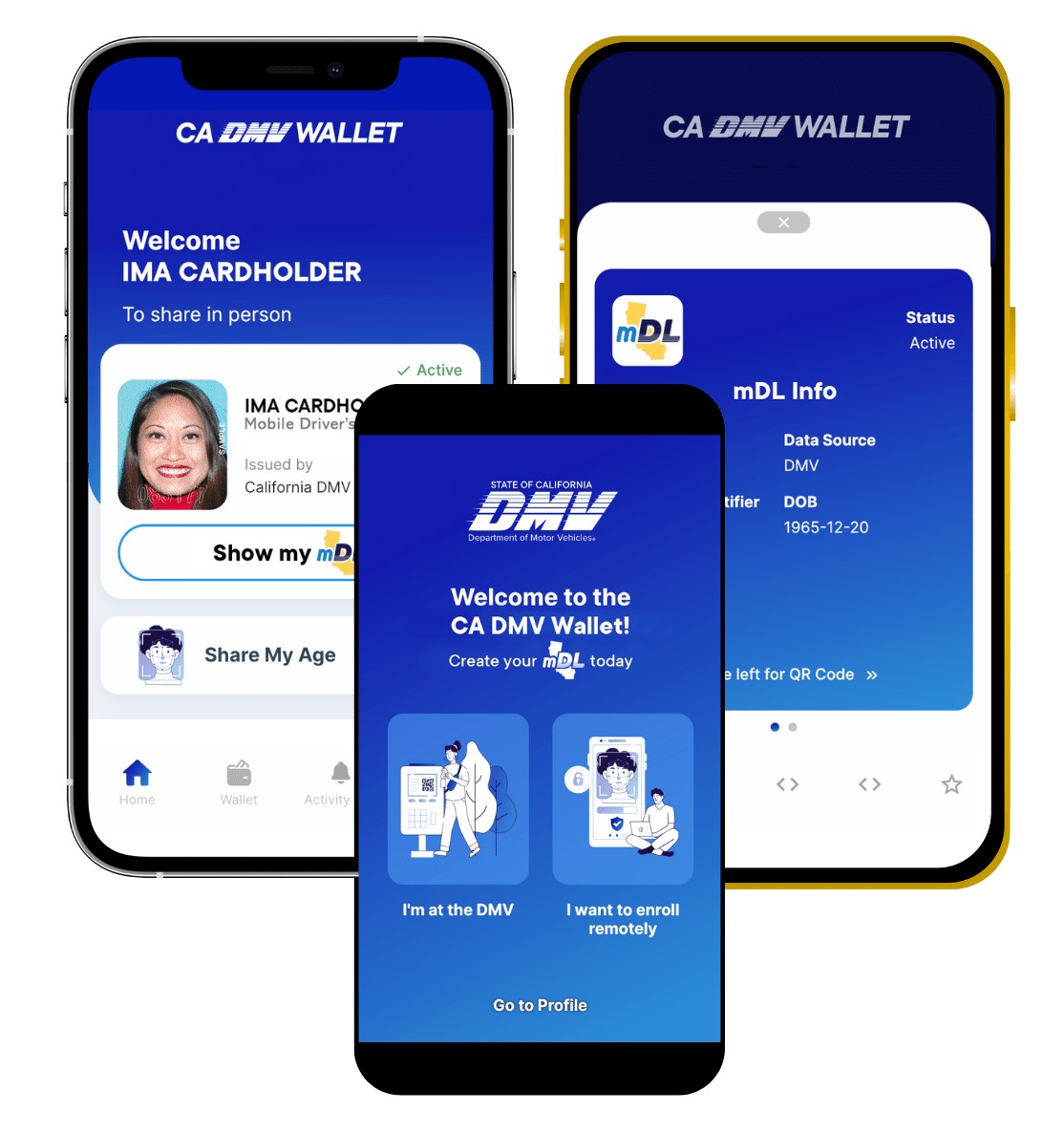
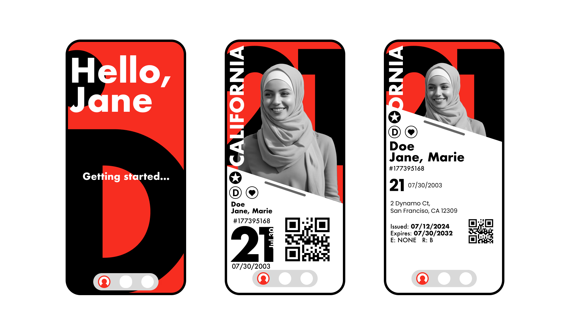
The CA Digital DMV Wallet. The onboarding is decent but it does nothing to visualize California's identity or branding.
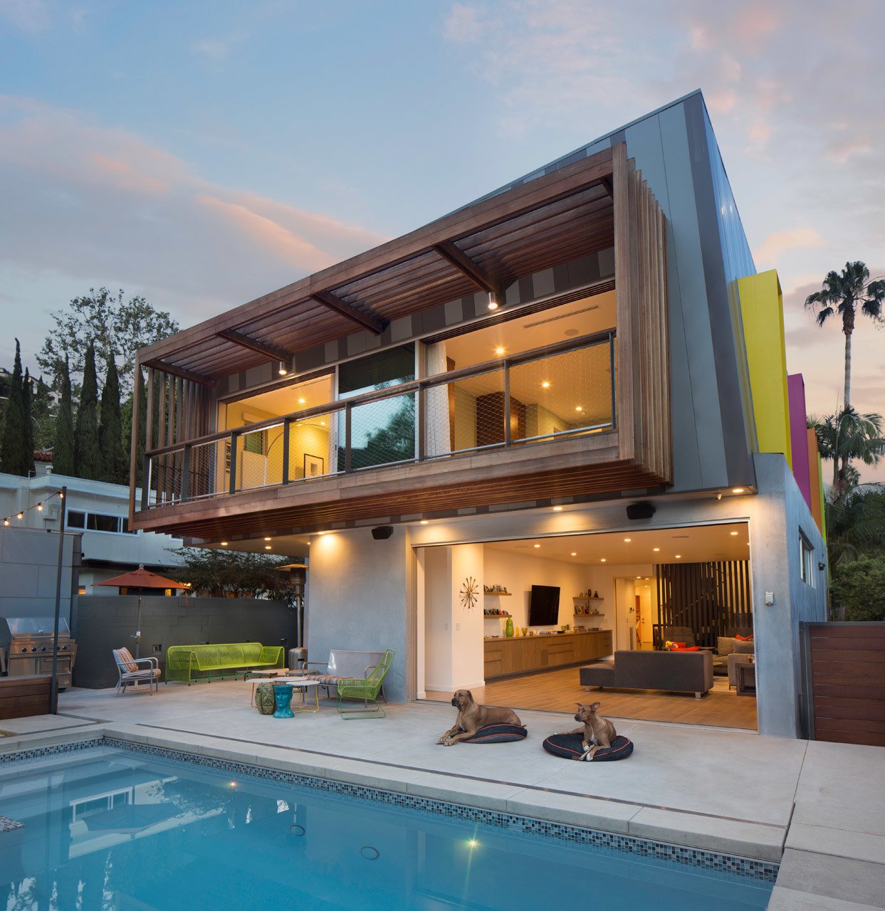
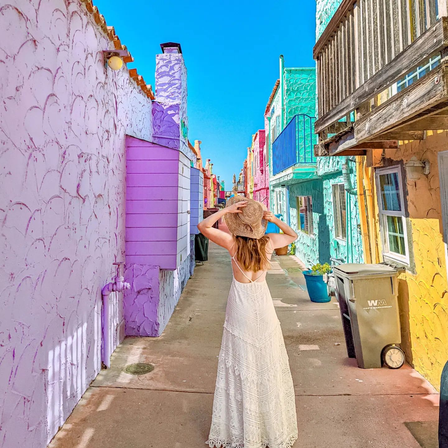
I explored California's visual culture, landscape, architecture, and lifestyle to inform the design direction.
04 · Goals
After conducting research, I defined three core goals for the project:
05 · Design Process
Having gathered more information about California's cultural identity, I created two moodboards for two different stylistic directions.
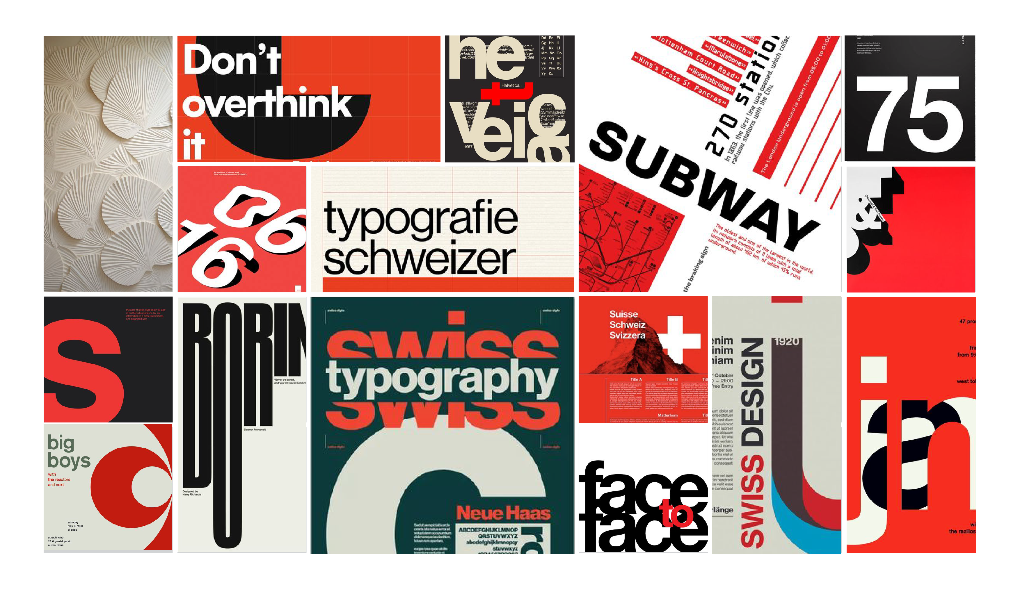
Inspired by the modern geometric architecture used by many residents in California.
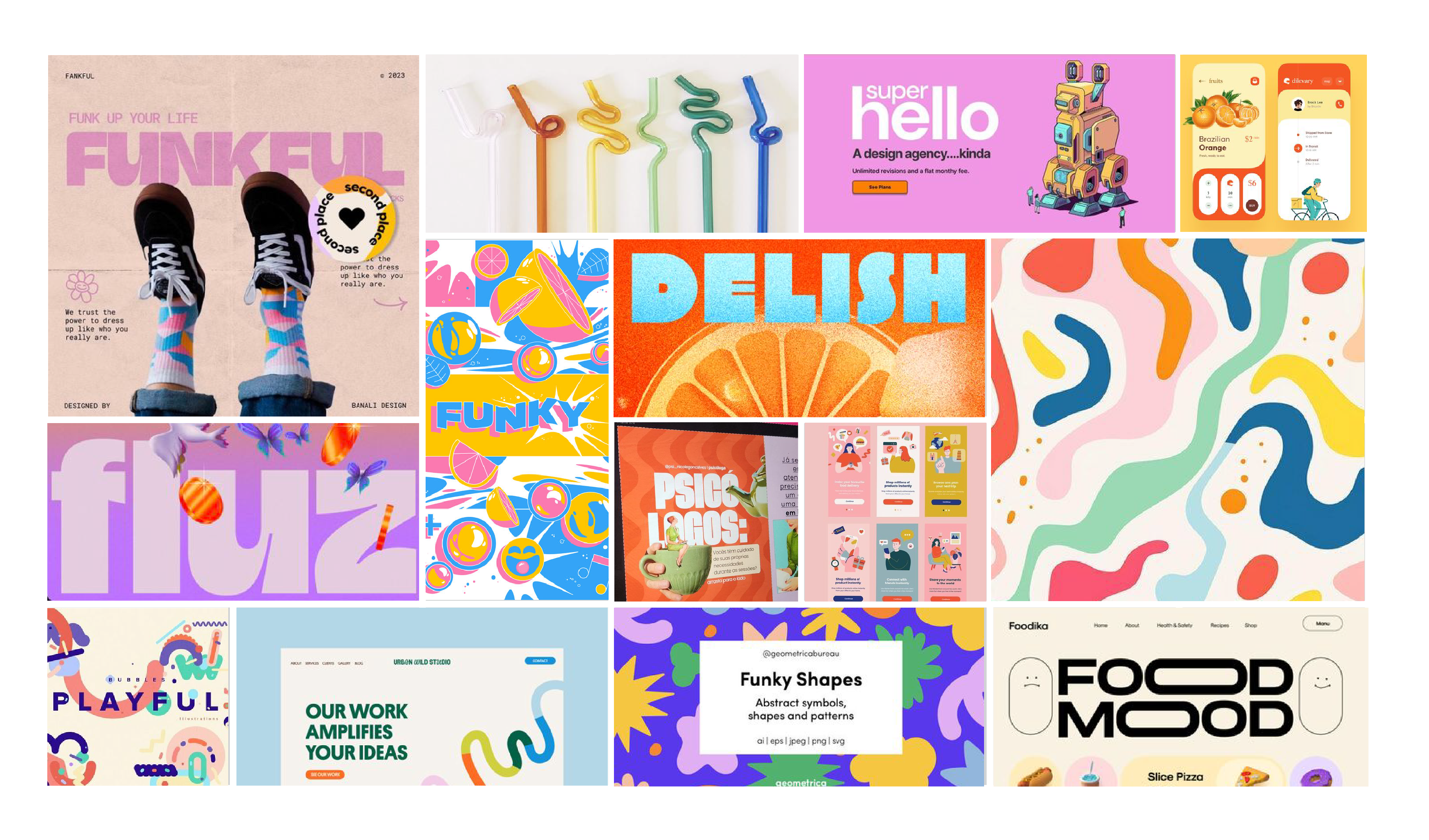
Inspired by the colorful, playful nature of California and its residents.
I sketched out initial concepts to explore layout options and information architecture.
I developed both visual directions into high-fidelity mockups to compare their effectiveness.
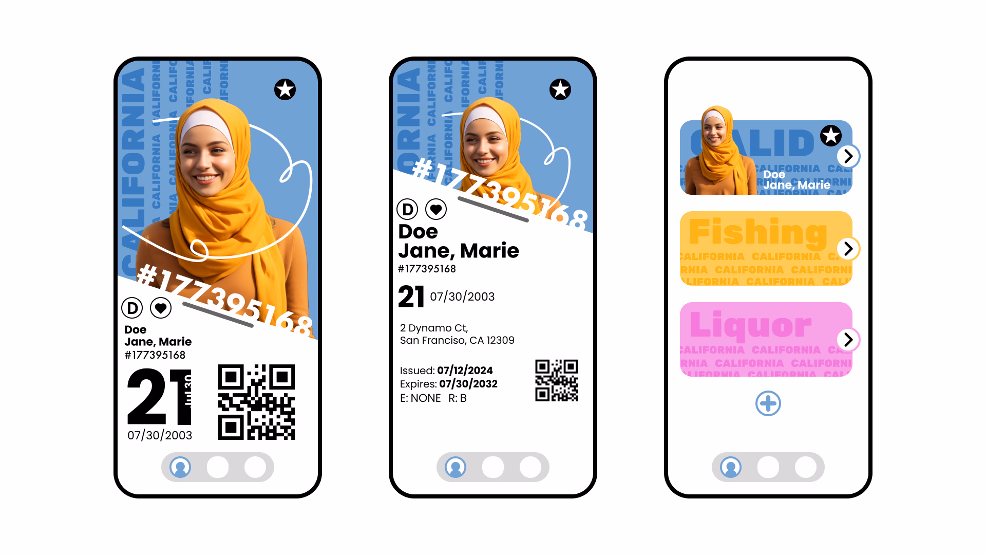
For this iteration I chose to continue with only Style 2. Style 1 felt more intense and closer to propaganda, while Style 2 felt free, playful, fun, and warm, which feels much more aligned with California's identity.
Second iteration focusing on the organic, playful direction.
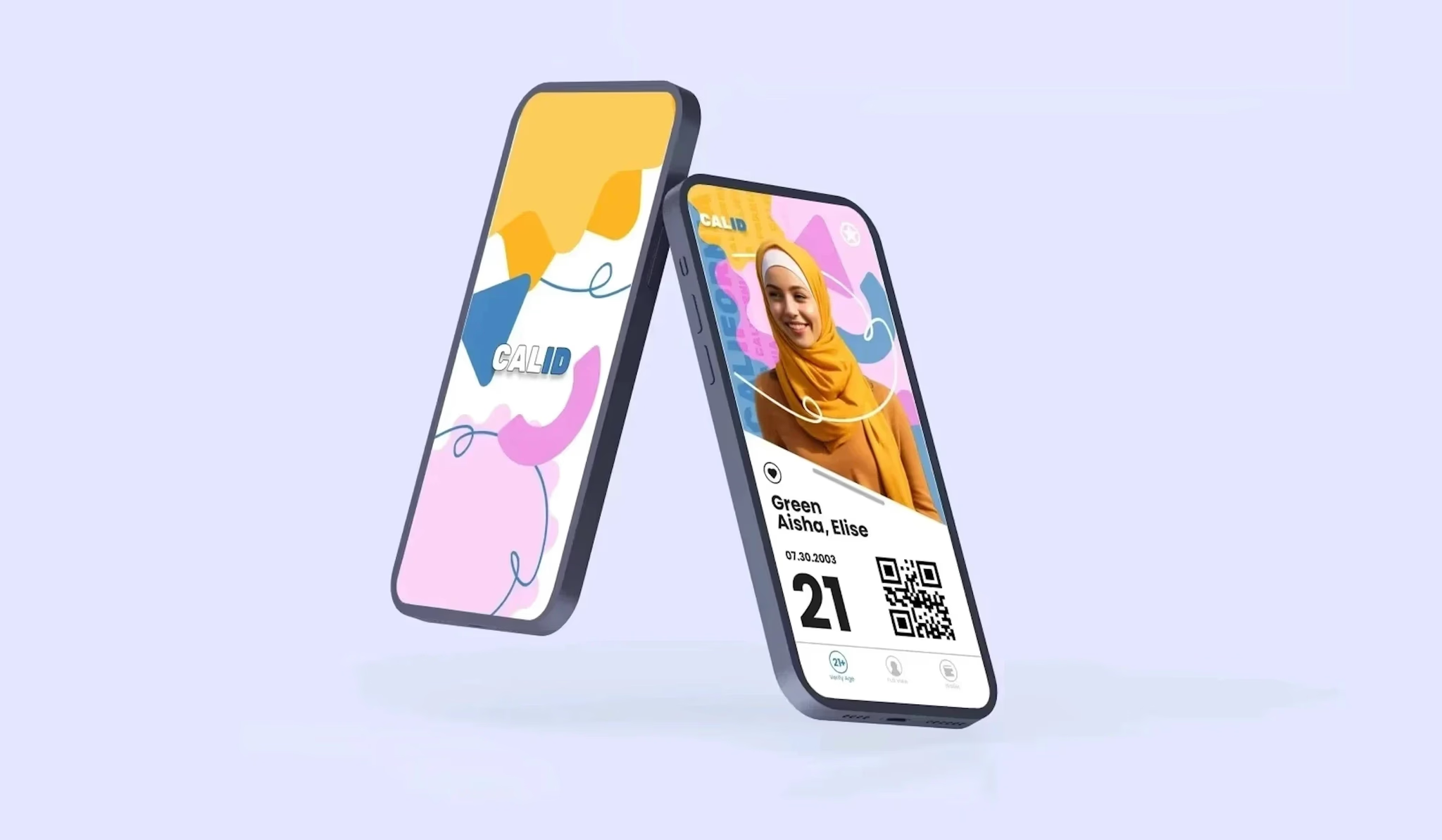
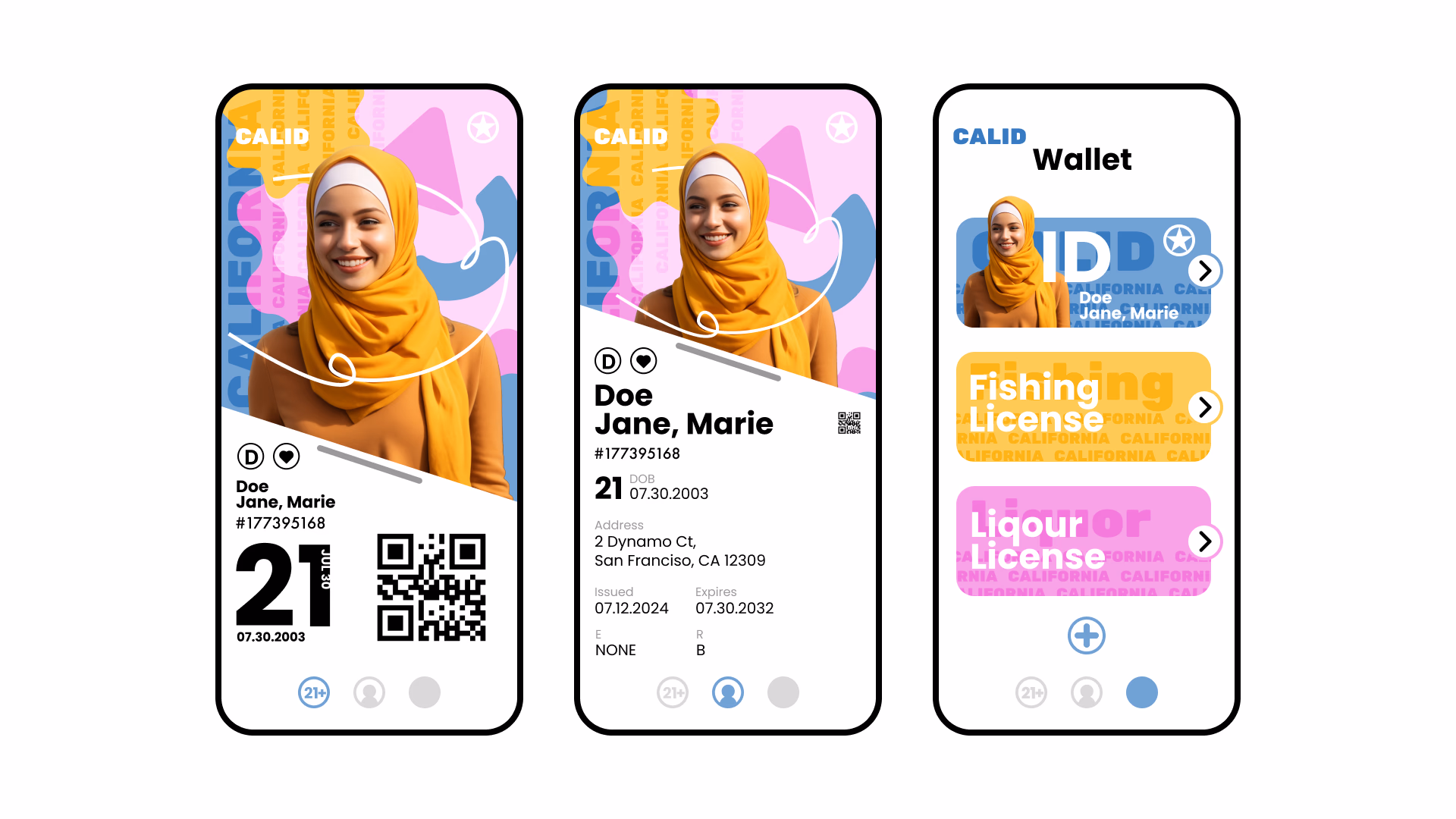
06 · Final Design
The final design embraces California's vibrant personality through organic shapes, warm colors, and clear information hierarchy. The interface prioritizes security by revealing sensitive information only when needed, while maintaining an approachable and friendly aesthetic.
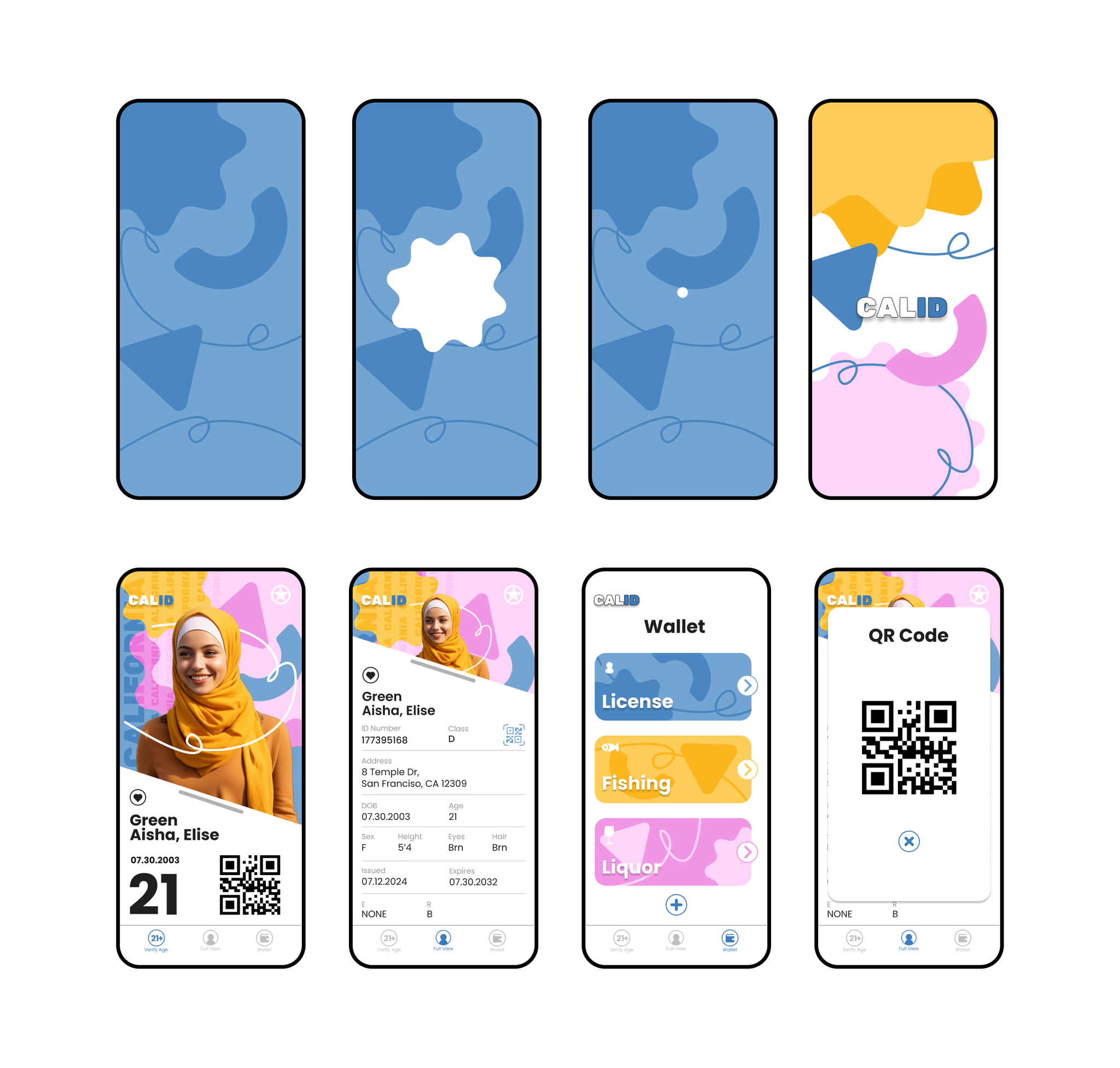
Final screens across key flows.
07 · Reflection
This project taught me a lot about balancing functionality with personality. State IDs have a lot of required information and real security considerations, so the challenge was making all of that feel approachable and distinctly Californian rather than just clinical.
Exploring two completely different directions early on was really valuable. It forced me to make a clear choice and commit to it with intention rather than just picking whatever felt comfortable first. The iterative process made the final design a lot stronger.
The big takeaways: simplicity, clear hierarchy, and consistent visual identity aren't just aesthetic choices. They're what makes something actually usable.