Case Study · App Design
Flow
System.
Reimagining the regional airline booking experience for New England travelers.
Case Study · App Design
Reimagining the regional airline booking experience for New England travelers.
01 · Overview
Regional airlines often struggle with booking interfaces that are overwhelming and hard to navigate. HarborAir needed a streamlined booking experience that makes the process quick and intuitive for New England travelers. This project covers both the booking flow itself and a comprehensive design system built for consistency and scalability.
02 · The Challenge
While researching for this project I found three major issues that show up in existing airline booking experiences:
03 · Research
I analyzed major airline booking platforms including Southwest, JetBlue, and Delta to understand common patterns and pain points.
I explored New England's visual culture, coastal landscapes, and local character to inform a design direction that would actually resonate with regional travelers.


04 · Goals
After conducting research, I defined four core goals for the project:
05 · Design Process
I broke the booking flow down into six clear steps, each focused on a single decision point. The goal was to reduce cognitive load by never asking users to think about more than one thing at a time.
Step 01
Select departure and destination cities
Step 02
Choose travel dates
Step 03
Pick departure times
Step 04
Confirm flight details
Step 05
Enter payment information
Step 06
Receive booking confirmation
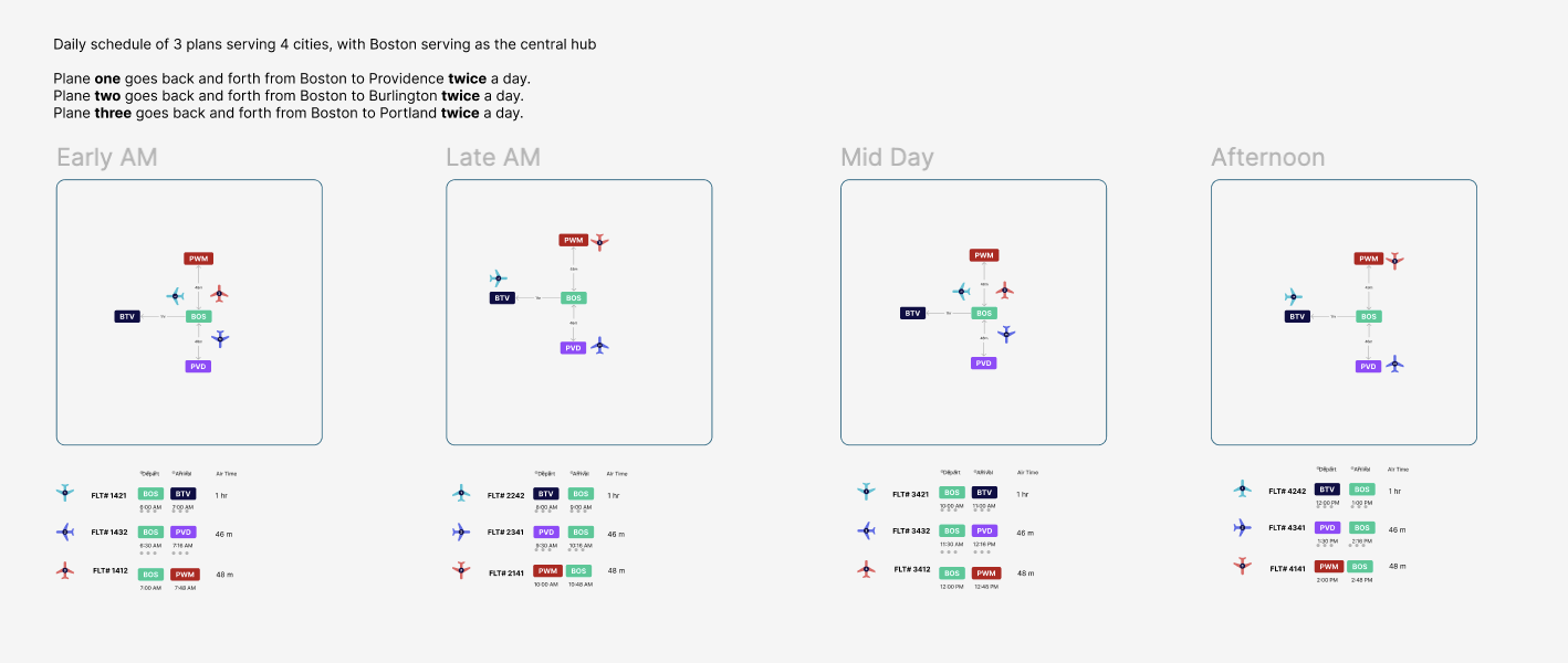
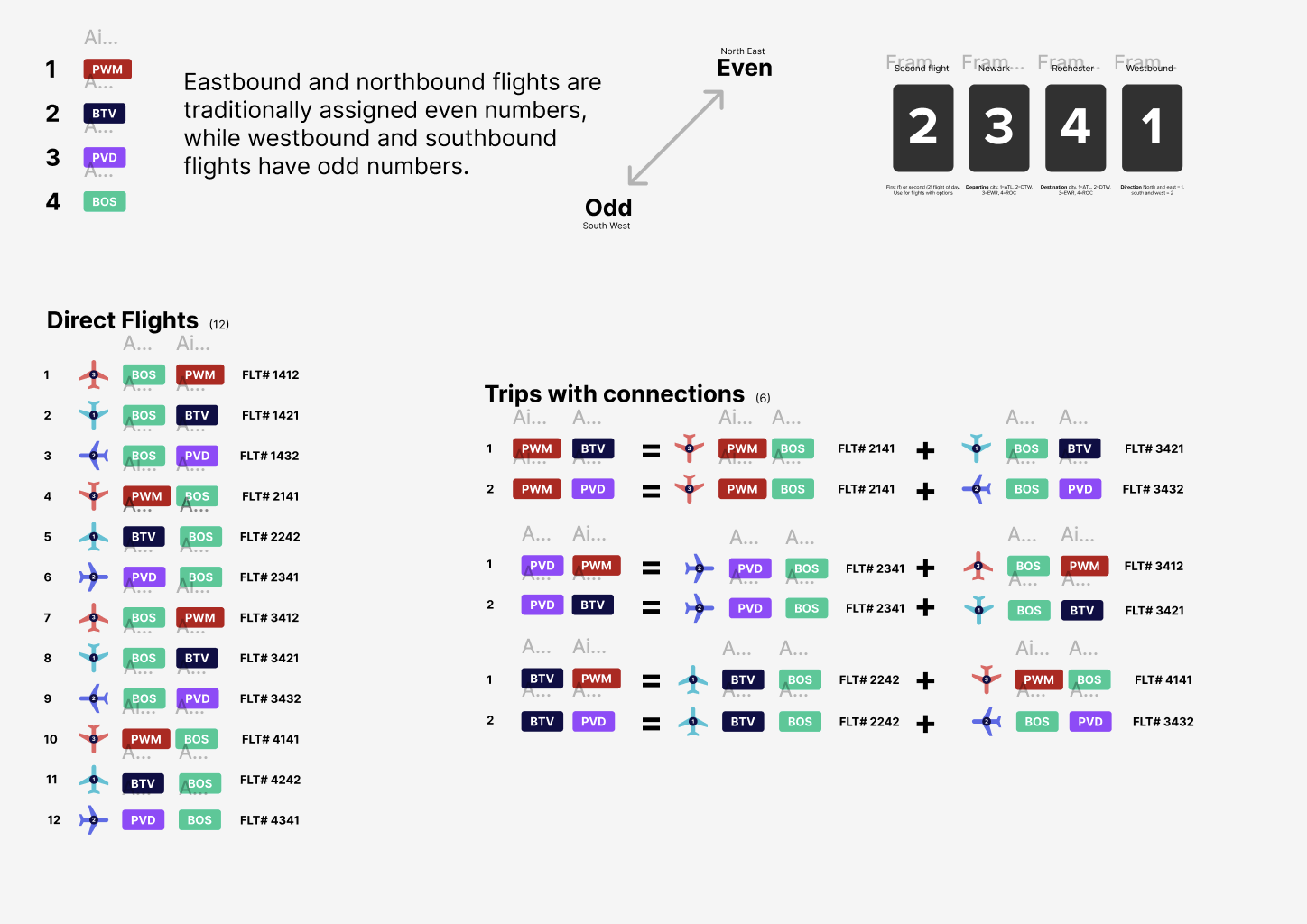
Part of this process also involved planning out actual flight times, patterns, and codes. I decided there were three planes in total and four possible destinations to keep the system realistic and testable.
I developed a visual language using gradients, large corner radii, and decorative elements that reference New England's coastal character. The goal was a design that felt regional and distinctive without being gimmicky.
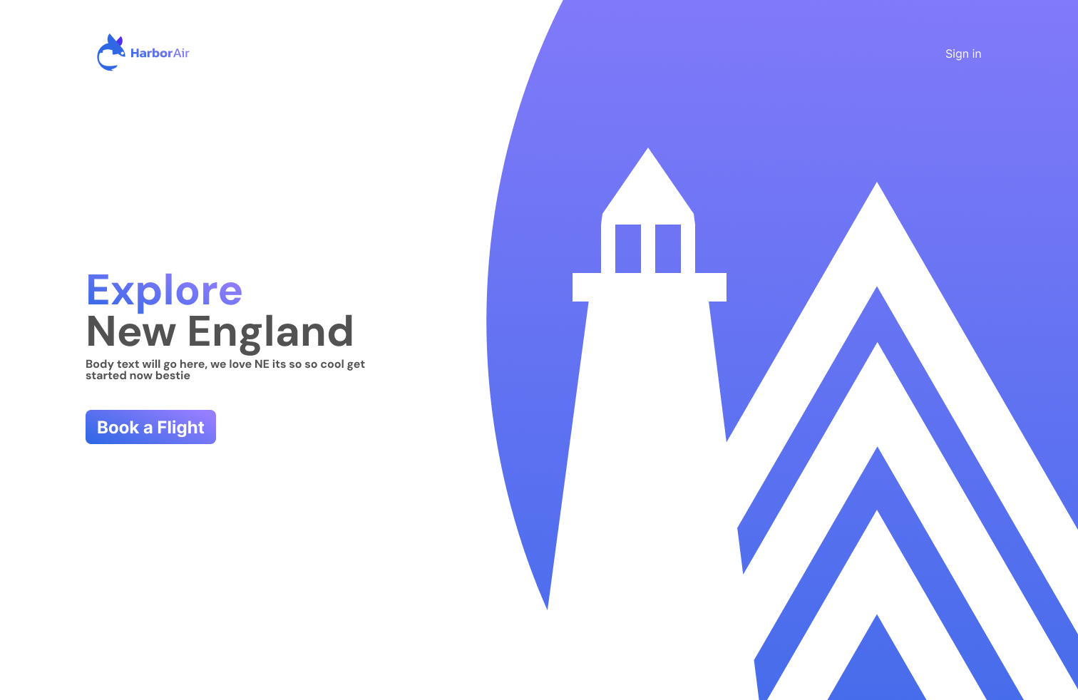
The landing page establishes the brand with gradient typography and a clear call to action.
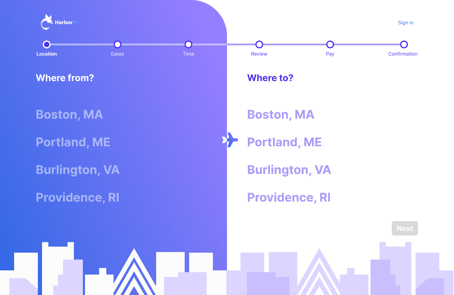
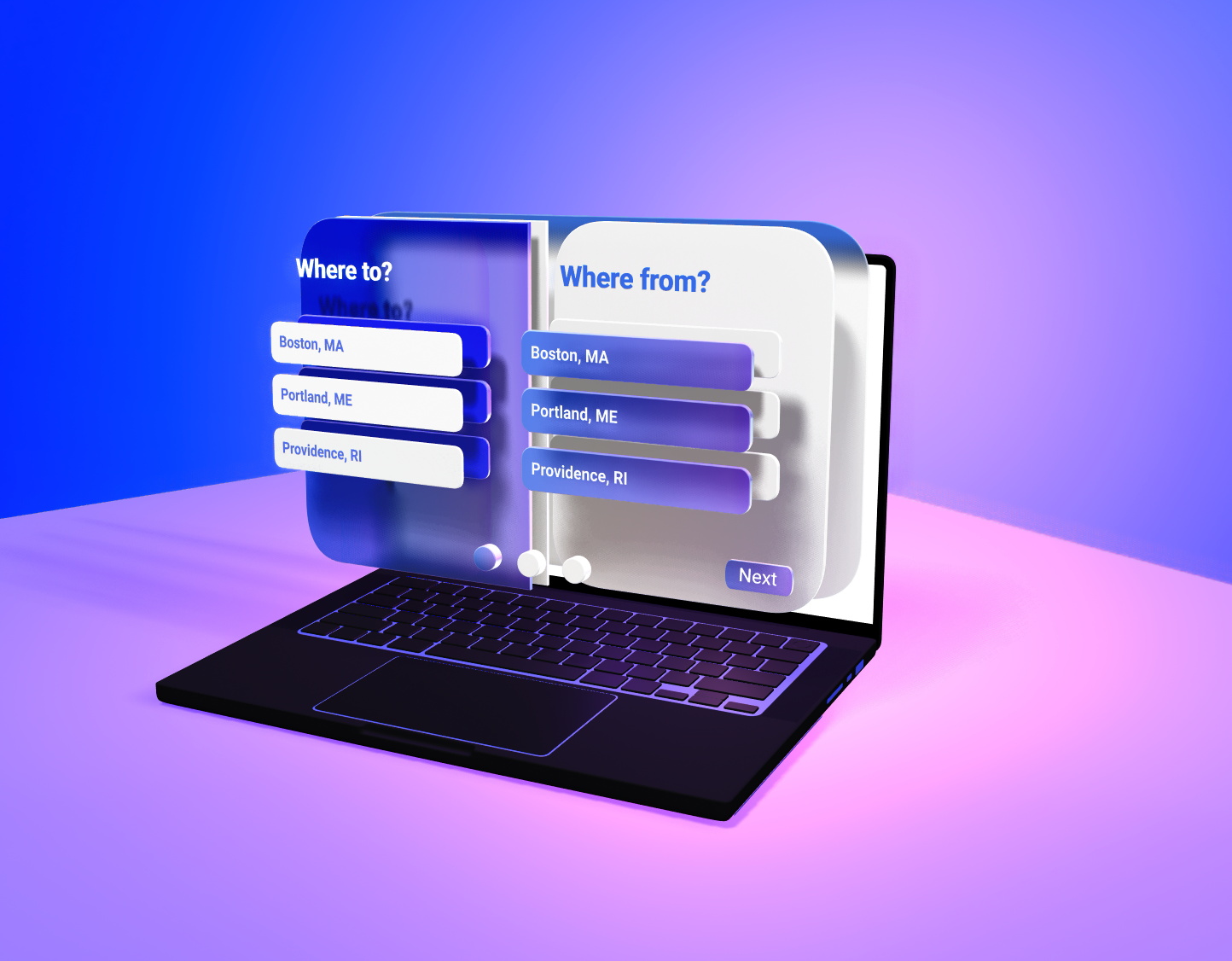
A split-screen layout with distinct visual zones for departure and destination. The progress bar keeps users oriented throughout.
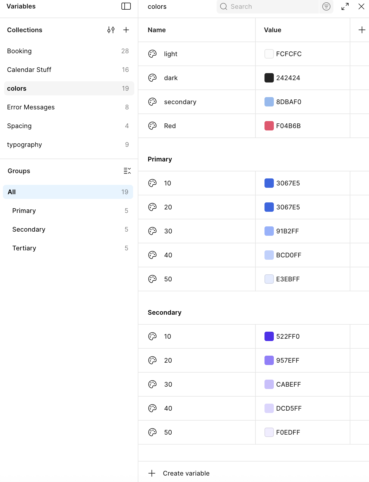
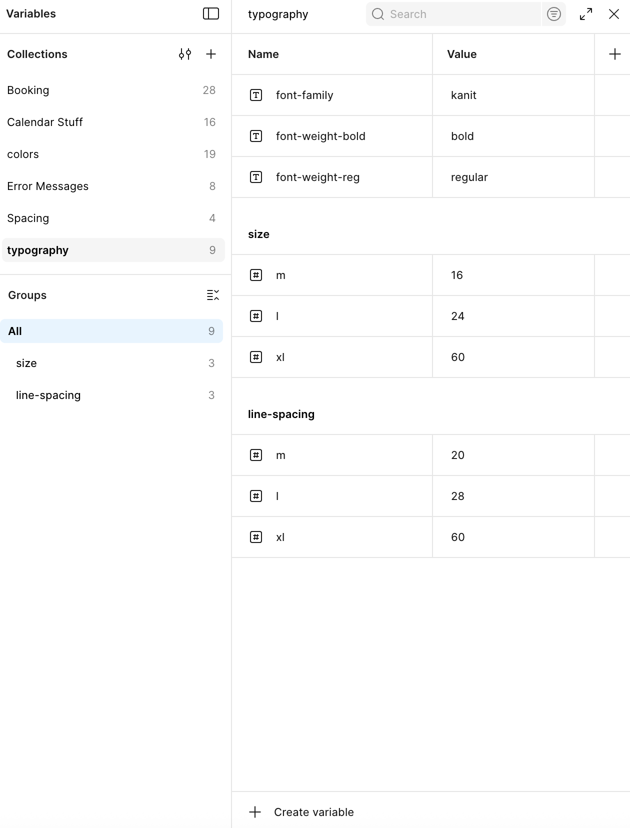
I built a comprehensive design system to ensure consistency across the product and make future scaling easier. This included design tokens, Figma variables, and a full component library.
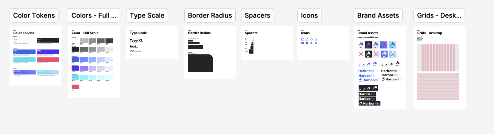
Design tokens defining the core visual language.
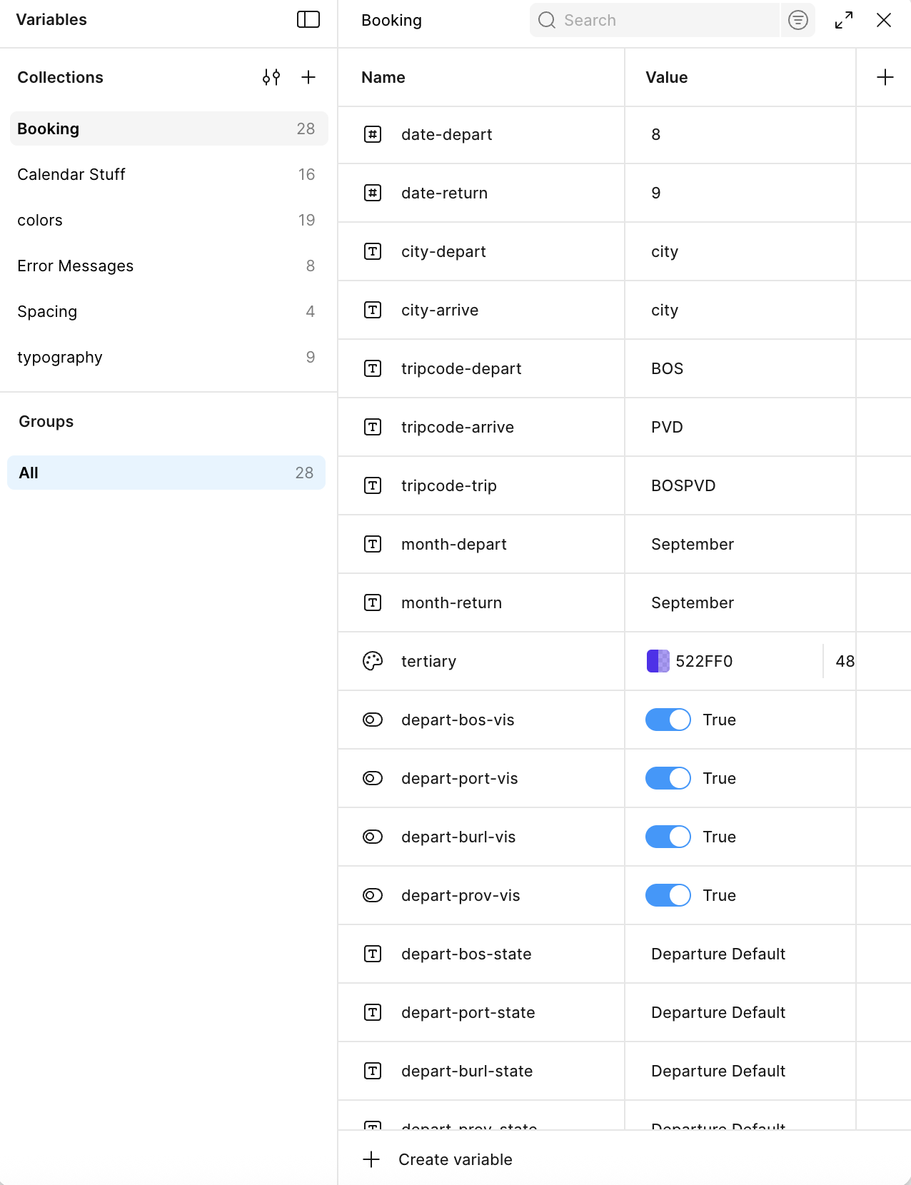
I organized everything using Figma variables to make the system adaptable and easy for developers to work with.
06 · Final Design
The final design is a progressive multi-step booking flow with clear visual hierarchy and distinctive branding. Each screen features a persistent progress indicator, large touch-friendly targets, and cityscape illustrations that reinforce the New England regional identity.
The bold gradient system, signature 120px corner radius, and Kanit typography create a modern identity that stands out in the regional airline market.
07 · Reflection
This project taught me a lot about breaking down complex flows into something that feels simple for the user. The six-step structure sounds obvious in hindsight, but getting there required really thinking carefully about what each step needed to accomplish and nothing more.
Building a full design system alongside the product was also a really valuable experience. It forced me to think systematically rather than just solving individual screen problems, and made the whole project feel more cohesive because of it.
Competitive analysis was more useful than I expected going in. Looking at what other airlines were doing well and what was frustrating gave me a concrete starting point instead of designing in a vacuum.